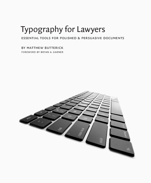
With Typography for Lawyers Matthew Butterick – who is a typographer turned lawyer – has performed a service for lawyers that no-one else has done for other professions. Go on, Google “Typography for” and see what you come up with.
You have to be a lawyer seriously concerned about the effect of print on page to get “typography for lawyers” and unfortunately most lawyers are not; rather they care about the law and lawyering – or at least their little corner of the law and lawyering. Fair enough; they’re lawyers first and foremost. But typography matters an awful lot to how lawyers project themselves on the page, to other lawyers, to clients or to the courts; and that’s Matthew’s message: lawyers, more than most other professions, are publishers and should be held to the same standards as professional publishers.
With modern word processing applications and printers we have sophisticated typesetting systems capable of producing high quality, “polished and persuasive”, professional documents. There is no excuse for using them as if they were typewriters upon which all those archaic rules and conventions are based.
So lawyers should buy this book. They need to know about the difference between straight and curly quotes, different types of dashes and different types of spaces. They should learn once and for all why you shouldn’t put two spaces after a full stop or start a new paragraph by hitting the return key twice; and why you almost never should underline stuff or TYPE IN ALL CAPS. And there’s 101 more easily-digestible, well-illustrated rules and tips in this book’s 216 pages. Although there are many references and examples from US practice, it’s not difficult to relate them to UK equivalents.
Even if most lawyers won’t hear or care about this book, in a professional firm there should be at least one person who does. There must be someone responsible for setting standards? Setting up suitable templates and styles for standard use in a firm will go a long way to improving the professionalism of a firm’s printed output and save users time. Matthew doesn’t address this directly – in the next edition, perhaps?
Matthew Butterick is an attorney in Los Angeles; he runs Butterick Law Corporation. Typography for Lawyers grew out of his website of the same name and is published by Jones McLure at $25. Unfortunately, it’s not distributed in the UK so you’ll be paying a bit more for delivery and waiting a little. (My review copy, courtesy of Matthew, arrived from Jones McLure within a week – thanks guys!)
You can preview pages here.

Nick,
We (Jones McClure) can handle international shipping. So wherever your readers are, they can order the book through our website.
Right – I’ll just delete the Amazon bit then.